Today we presented our presentations on our chosen subjects to 8 other people in groups. We were given 5 minutes to present, then 1 minute to give one another feedback on sticky notes. Once we read our feedback, we had to split it up into three groups.
The three groups were: (colour coded) Things that you like to hear to boost your ego (nice things) Good and concise, or constructive feedback Other feedback, or feedback that you want to know more about to achieve
My feedback was as follows: - passionate about the subject - clear and precise presentation - good knowledge on his bio - clear pictures - could have expanded to talk about influences etc - good in-depth info on personalities and ethos of designers, as well as their work - good idea to narrow down a broad subject - focussed - kept relevant to GD as opposed to fashion - think about offering a comparison - could have been more in-depth with some areas - was quite short - good that you picked a broad topic and made it more focussed - in-depth and detailed - clean layout for the presentation, not over textual - interesting designer and designs - need more information about where you are going with it - specific - sound genuinely interested in topic - at times the research was a little limited - over all a good, well delivered presentation - good knowledge on the subject - could explain why you're interested in the subject - well presented
Once we analysed our feedback, we were asked to write 3 objectives on how to make your summer brief better.
My 3 objectives:
- Try to compare Peter Knapp's work to other designs at the time
- Expand on research into Knapp's influences
- Explain why you are interested in the topic
I've always been really interested in fashion and editorial design - in fact before taking my last course in Graphic Design at college, I was going to take a course in Fashion & Editorial Photography. I have also found that one of my strengths is in editorial/publication design, so thought that this would be a well suited topic for me to research into.
I really love the use of mixed media in this exclusive for Sicky Magazine - I think that it really differs from your usual fashion photographs and designs, as it adds a new sense of depth and point of interest to the photos. I also find the use of pastel colours for the backgrounds interesting, as you don't usually find this within fashion photography.
I love the colour theme for this feature in Coco magazine. I think the photos are absolutely stunning and the typography that has been chosen works really well with the images. I prefer the minimal use of typography, as it doesn't interfere too much with the featured photos.
I absolutely love this design for the cover of Node Magazine. I definitely prefer the light blue version to the darker blue more simple version. I think that the use of grids in the light blue version is really interesting and the typography works really well with the photograph. I also find that the colour scheme is really well suited throughout the designing and the photography.
I love the simplicity of this edition of P magazine. The layout of a lot of the grids is really interesting and the simplistic use of typography is extremely effective and aesthetically pleasing. I like how each double page spread differs in layout and content, and I particularly enjoy how typography is often positioned sideways, so that the reader will have to interact with the book and turn it round to read the words.
The layout of this magazine is really interesting - the grids have been used really well and the whole magazine looks really modernised and up to date with design trends. The use of the same 2/3 colours also adds to the overall effect of the design.
The colours used are really complimentary of one another and easy on the eye. The minimal use of typography obviously works well in this kind of magazine, as really it is all about the clothes and the photos. The front cover is quite unusual for a fashion magazine cover, but I still find it really appealing.
The biannual magazine for Topshop is interesting due to the use of mixed media in the photographs which coincides along some very simplistic typography and grid layout.
The idea behind these images is really engaging and unique. I actually like how the faces have been 'erased', and it helps you to pay attention to the brand and their clothes, rather than the models' beauty. I also think that the use of mixed media and paints over the edited photographs works surprisingly well and adds texture to the images.
I adore this editorial design 'Bridal Collection Dossier' for Miquel Suay as it is completely different to the other editorial designs I've been looking at - the use of mixed stocks, for example tracing paper, and the addition of a hard back cork board for the back of the magazine makes it feel hand made and unique. The layout is alluring and the colour choice of black and white helps make the magazine seem elegant, like the dresses within the publication.
I really enjoy the simplicity of this magazine, both in the design and layout itself, and the colour choice. Even the photographs are really minimal - all about the model and her clothes, stripped down to very minimal makeup and masculine hairstyles. Occasionally I found the typography choices were a bit much, or a bit messy, however this is made up for by the strong photography and grid choice.
Facts & History About The Subject:
Although tailors and dressmakers were no doubt responsible for many innovations, and the textile industry certainly led many trends, the history of fashion design is normally understood to date from 1858 when the English-born Charles Frederick Worth opened the first true haute couture house in Paris. The Haute house was the name established by government for the fashion houses that met the standards of industry. These fashion houses have to adhere to standards such as keeping at least twenty employees engaged in making the clothes, showing two collections per year at fashion shows, and presenting a certain number of patterns to costumers. Since then, the professional designer has become an increasingly dominant figure, despite the origin of many fashions in street fashion.
PETER KNAPP:
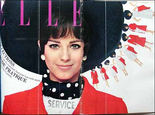
When Peter Knapp launched his career back in the 1950s, he was one of the very first art directors. His prolonged spell at the French fashion and lifestyle magazine 'Elle' enabled him to reinvent the codes of print layout.
Peter Knapp was born in 1932 in Bäretswil, Switzerland. He studied graphic design in Zurich and talented in painting continue his studies in Paris. Knapp left Switzerland in 1952 and studied at the Ecole des Beaux-Arts in Paris. His skills as a page designer and his research into typography, quickly attracted attention.
At age 25, he landed a position as artistic director of the famous Parisian department store Les Galeries Lafayette where he was in charge of advertising and window displays. Later, Hélène Lazareff, the founder of Elle magazine, first hired him as editor at Le Nouveau Femina and their collaboration then continued with Knapp hired as the artistic director of the magazine Elle, in 1959. At Elle , he worked with some of the biggest names in fashion photography, such as Jeanloup Sieff, Sarah Moon, and Olivier Toscani and also took photographs himself. Knapp left the magazine in 1966, but returned in 1974 as its art director.
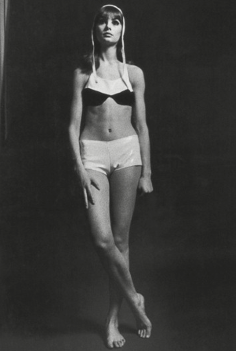
The strength of his fashion photographs for designers such as Courrèges, Unagaro, Lagerfeld, Yves Saint-Laurent, Montana, and Mugler relied upon the quality of his personal interaction with his models. Knapp worked for almost twenty-five years with the couturier Andre Courreges. Whether it be painting, filmmaking, graphic design, or photography, Knapp's taste for experimentation has always been pronounced. Knapp innovated techniques for creating images such as filming in 16mm to extract photogrammes, which he then published in the magazine.
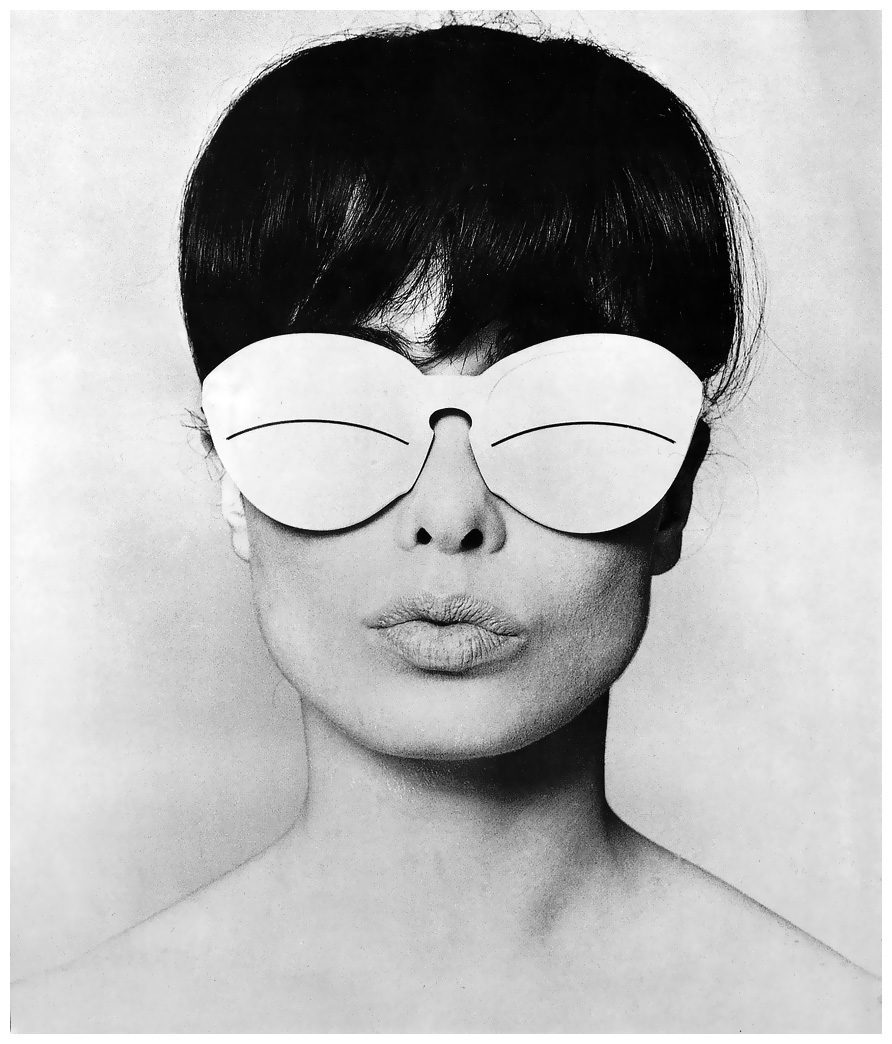
He was innovative exhibiting his photographs; Knapp was one of the first artists to display large color photographs in galleries, at a time when most photographers were working in the more traditional format of black and white. In his layouts, text and image are telescoped together to form large visual compositions. The title runs right across the double page, while the model appears to break out of the picture frame. Knapp also loved the medium of film, and in 1966, he embarked on a series of short films devoted to fashion for the television programme "Dim Dam Dom," made by Daisy de Galard from Elle. One of his more recent films recounts the last days Vincent Van Gogh spent at Auvers-sur-Oise.
Drawing on ‘primitive’ art and the decorative arts, Peter Knapp was passionate about creating images. Influenced by the creations of Alexey Brodovitch, he sought to inject artistic creativity into this mainstream magazine. Knapp worked with famous models such as Jean Shrimpton. Peter Knapp draws inspiration from several themes, including the sky, its colors, and the events that can occur to interrupt its unity. After his lengthy collaboration with Elle and other magazines such as Stern, Vogue and the Sunday Times Magazine, he gradually focused more on his personal work retaining an interest in page design.
He was involved in a range of publishing projects, including the astonishing encyclopedia entitled "Le Livre de la Santé" ("The Book of Health", 1967) whose pages he designed using the work of famous illustrators and photographers; a totally unexpected approach in this type of book. He designed the page layout for a number of art books, including an award-winning book on Giacometti in 1991, and also worked with the Editions du Centre Pompidou on a collection entitled "Contemporains". Also Peter Knapp: La Passion des images which included black-an-white fashion shots illustrating his fashion career from the 60s through the 80s.
At 78, Peter Knapp is still very active traveling from France, to Switzerland, to New York, where he continues his artistic work.